Lib: UI Extender





A FoundryVTT module library that adds easy ways to extend the base Foundry UI.
Overview
Lib: UI Extender lets a module add HUD buttons, scene control tools, sidebar directories, and settings buttons by registering them, rather than by wrapping core methods itself. Registrations all go through the library, so several modules can extend the same part of the interface without conflicting.
This is a library. Install it alongside a module that requires it; on its own it does nothing.
Features
- Easily add new HUD controls to tokens, tiles, or drawings
- Easily add new scene controls to any layer controls (token, tiles, drawings, walls, etc.)
- Easily add new sidebar directories
- Easily add a button to the Settings sidebar that opens your module's settings
- Fully typed library included in repository for Typescript projects
Settings
| Menu | Description |
|---|---|
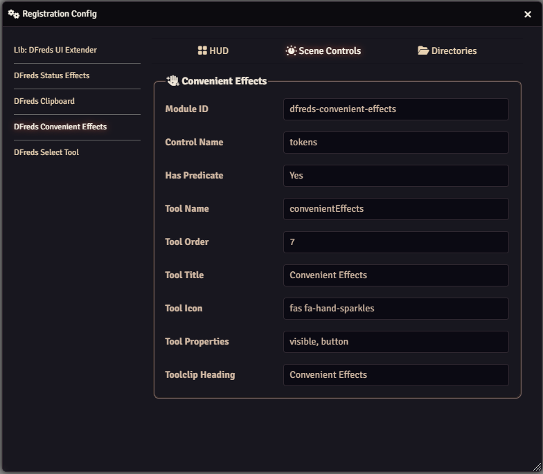
| Registration | View details of the HUD buttons, scene controls, directories, and settings buttons that modules have registered. |
This menu is restricted to Game Masters. It is read-only and exists for debugging - nothing in it changes how the library behaves.
Usage
To use this in your own module, you can do any of the following:
- Use the
uiExtender.inithook (which fires based on Foundry'sinithook) and register your UI elements on the provided instance ofuiExtender - Use the
window.uiExtender(accessible as justuiExtenderin console and code) and register in Foundry's init method.
Everything will be ready to render when the Foundry setup hook is complete.
Check the Migration Guides for details on updating a module between Foundry Versions.
Hooks
Lib: DFreds UI Extender provides a few hooks.
uiExtender.init- This is called once on Foundry'sinithook. It should be used to register your controls using the provided instance ofuiExtender.uiExtender.setup- This is called once on Foundry'ssetuphook. At this point, all controls will be created and available when they render.
API Methods
Currently, these are the supported API methods:
Register Scene Control
A scene control is a button that is located on a specific layer. Under the hood,
this uses the getSceneControlButtons hook.
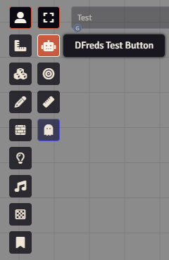
registerSceneControl(input: SceneControlInput)
For the type information for SceneControlInput, look at the types defined in
the repository here.
An example:
export function mySampleModule() {
  Hooks.once("uiExtender.init", (uiExtender) => {
    uiExtender.registerSceneControl({
      moduleId: MODULE_ID,
      name: "tokens",
      tool: {
        name: "testing-button",
        title: "DFreds Test Button",
        icon: "fas fa-robot",
        button: true,
        order: 2,
        onChange: (event, active) => {
          console.log("onChange", event, active);
          ui.notifications.info(`You clicked me! Active: ${active}`);
        },
      },
    });
}
Register HUD Button
A HUD button is a button located on a specific item on the canvas when you right click. Under the hood, this uses the render${type}HUD hook.
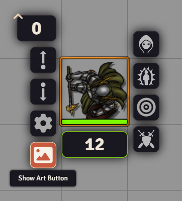
registerHudButton(input: HudButtonInput)
For the type information for HudButtonInput, look at the types defined in
the repository here.
Some examples:
export function mySampleModule() {
  Hooks.once("uiExtender.init", (uiExtender) => {
    uiExtender.registerHudButton({
      moduleId: MODULE_ID,
      hudType: "token",
      tooltip: "Show Art Button",
      icon: `<i class="fas fa-image fa-fw"></i>`,
      location: "div.left",
      onClick: (
        _event: JQuery.ClickEvent,
        _button: JQuery,
        _token: any,
      ) => {
          console.log("clicked");
      },
      onRightClick: (
        _event: JQuery.ContextMenuEvent,
        _button: JQuery,
        _token: any,
      ) => {
          console.log("right clicked");
      },
    });

    uiExtender.registerHudButton({
      moduleId: MODULE_ID,
      hudType: "tile",
      tooltip: "Show Art Button",
      icon: `<i class="fas fa-image fa-fw"></i>`,
      location: "div.left",
      onClick: (
        _event: JQuery.ClickEvent,
        _button: JQuery,
        tile: any,
      ) => {
        new ImagePopout(tile.texture, {
          title: "Tile Image",
          shareable: true,
        }).render(true);
      },
      onRightClick: (
        _event: JQuery.ContextMenuEvent,
        _button: JQuery,
        tile: any,
      ) => {
        new ImagePopout(tile.texture, {
          title: "Tile Image",
          shareable: true,
        }).render(true);
      },
    });

    uiExtender.registerHudButton({
      moduleId: MODULE_ID,
      hudType: "drawing",
      tooltip: "Say Hi",
      icon: `<i class="fas fa-robot fa-fw"></i>`,
      location: "div.right",
      onClick: (
        _event: JQuery.ClickEvent,
        _button: JQuery,
        drawing: any,
      ) => {
        ui.notifications.info(
            `Hello from drawing ${drawing.fillColor}`,
        );
      },
    });
  })
}
Register Sidebar Directory
A sidebar directory is a button located on the sidebar.
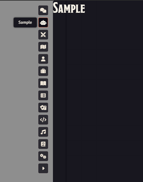
registerDirectory(input: DirectoryInput)
For the type information for DirectoryInput, look at the types defined in
the repository here.
Some examples:
const { AbstractSidebarTab } = foundry.applications.sidebar;
const { HandlebarsApplicationMixin } = foundry.applications.api;

// An application must extend AbstractSidebarTab
class SampleApplication extends HandlebarsApplicationMixin(AbstractSidebarTab) {
    static DEFAULT_OPTIONS = {
        window: {
            title: "Sample",
        },
    };

    static PARTS = {
        sample: {
            template: `modules/${MODULE_ID}/templates/sample.hbs`,
        },
    };

    static tabName = "sample";
}

export function mySampleModule() {
  Hooks.once("uiExtender.init", (uiExtender) => {
    uiExtender.registerDirectory({
        moduleId: MODULE_ID,
        id: "sample",
        tooltip: "Sample",
        icon: "fas fa-robot",
        before: "settings", // directly above the settings directory - takes precedence over `after` and `order`
        after: "items", // directly below the items directory - takes precedence over `order`
        order: 1, // positional index, resolved after other modules have inserted theirs

        applicationClass: SampleApplication,
    });
  })
}
Register Settings Button
A settings button is a button in the Settings sidebar tab that opens one of your module's applications. All registered buttons appear together in a Module Settings section, which sits between the "Settings and Configuration" and "Help and Documentation" sections. The section only shows up if at least one module has registered a button.
Buttons are listed alphabetically by name, so the order does not change as players enable and disable modules.
registerSettingsButton(input: SettingsButtonInput)
For the type information for SettingsButtonInput, look at the types defined in
the repository here.
An example:
const { ApplicationV2, HandlebarsApplicationMixin } = foundry.applications.api;

class MySettingsApplication extends HandlebarsApplicationMixin(ApplicationV2) {
    static DEFAULT_OPTIONS = {
        window: {
            title: "My Module Settings",
        },
    };

    static PARTS = {
        settings: {
            template: `modules/${MODULE_ID}/templates/settings.hbs`,
        },
    };
}

export function mySampleModule() {
  Hooks.once("uiExtender.init", (uiExtender) => {
    uiExtender.registerSettingsButton({
        moduleId: MODULE_ID,
        name: "My Module Settings", // can also be a localization key
        icon: "fa-solid fa-robot",
        gmOnly: true, // optional - only show the button to Game Masters
        applicationClass: MySettingsApplication,
    });
  })
}
The application is constructed with no arguments and rendered each time the button is clicked.
Handlebar Helpers
A few handlebar helpers have also been registered to make common use cases easier.
Compare
This will help in conditionally rendering some HTML depending on two values and the operator provided.
Operators include:
=====!=!==<><=>=typeof
{{#compare myDataString.length ">" "the string I want"}}
    <p>myDataString is longer than the string I want!</p>
{{else}}
    <p>myDataString is equal to or shorter than the string I want!</p>
{{/compare}}
{{#compare "Test" "Test"}}
    Default comparison of "==="
{{/compare}}
Is GM
This will help in conditionally rendering some HTML depending on if the user is a GM or not.
{{#if (isGm)}}
    <button class="view-backups">
        <i class="fas fa-arrow-rotate-left"></i>
        My GM Button
    </button>
{{/if}}
Strip HTML
This will remove any HTML elements from a provided string.
<h4><a title="{{stripHtml myHtmlString}}">Some link</a></h4>